Mac OSX Lion Upgrade

After painstakingly backing my 27″ iMac, I upgraded to Mac OSX Lion. Not a whole lot changed total UX wise. But I do like what I see except for Launchpad.

Speaking of changes, one thing that broke was the driver for my old black & white Samsung ML-1710. I ended up having to install Splix-2.0.0 which worked decently… Well, it prints — and that’s really all I care about.

So yay.

iPhone is the Reason I Wish I Knew C++

I knew not knowing the good old traditional c/c++ language would come back and haunt me one day.

The demand for iPhone developers exceeds the supply and I don’t see that changing anytime soon. The going rate for iPhone developers, at least the developers I know and trust, is $125/hour and up. I have some friends who are booked out at $200/hour for the next few months, although $125/hour seems to be the going rate in my network. At that rate, a full-time contract iPhone developer costs $5,000/week and it may take four to six weeks for an application to be developed. Sometimes it will take less and sometimes it will take more. Add to development the other costs – project management, design, QA, and marketing, to name a few. It’s not uncommon to spend $30,000 and up on an iPhone development project. iPhone applications are not cheap.

In this particular case, money is not necessarily the thing I am after, it’s really the excitement and possibility of working on a product I love and use everyday…

Tough Questions

A typical conversation with Bryan, my three-year-old….

Me: Bryan, Look. It’s raining.
Bryan: Why is it raining?
Me: Because there’s too much water in the cloud. And when there’s too much water in the cloud, water drops fall and becomes rain.
Bryan: Why is there too much water in the cloud?
Me: Because water evaporates into the air and eventually end up in the cloud.
Bryan: What is “evaporate”?
Me: ….
Bryan: Why is water falling from the sky? Is there a big hole in the sky?
Me: …. Um, no.
Bryan: Is the sky hard (as opposed to soft)?
.
.
.
I need to visit some science 101 sites for kids….

MacBook Pro Battery Replacement

About a little over a month ago, my MacBook Pro would just randomly shutdown when running on battery power even if the battery was still at around 60% charged. That really pissed me off because I really hate the process of having to restart and set up everything again before I can dive into work, not to mention the mysterious shutdowns was really getting me worried about data corruption (like it did to my Lightroom catalog).

Unfortunately I couldn’t really part with my computer for work reasons, so I hadn’t taken it to the Apple store because it might mean I’d have to leave my laptop there for a few hours (or even days). And I’d have to go through the motion of backing up everything again… But I decided to call Apple today anyway because it’s ridiculous that my less-than-one-year-old battery can now only stay unplugged for less than 1/2 hour on a full charge!

Apple told me was that batteries are “consumable goods”. And the tech support told me that an average battery life is for about 300 charge cycles, and mine was reading 463! I told them it’s understandable that a battery would ultimately become less chargeable over time, but for its capacity to drop so drastically within a period of less than two months is unusual.

They agreed. And a replacement battery is on its way courtesy to Apple.

So my MBP will soon resume its role as a portable again. Yay!

UPDATE 03.10.2008: My replacement battery arrived the next morning via DHL! Grace then called them to pick up the replacement unit the next morning; they came within a couple of hours… Wow.

WWSJD

Grace asked the other day what Alicia was talking about WWSJD… I paused in disbelief.

It’s no secret I am a Mac fanboy. More specifically, an Apple fanboy. Not that I think everything Apple does is the best, but everything they have done shows they have put a lot of thought and understanding in their products, services and their audience. I just can’t say the same thing about any other company.

So it’s only natural that I have come to admire how Apple has been able to design everything with an element of “human touch” to it. This was less evident during the “Steve-less” years of Apple. But suddenly when he returned, everything has a “Steve-ness” to it again! So I have concluded it’s the “Steve touch” that makes everything pop.

When I am stuck at a design decision, I try to clear my head and imagine “What Would Steve Jobs Do?” (WWSJD) if he was in the same situation…

Of course the act itself is a lost cause without having worked with His Steve-ness (though I came close having made to the final rounds of interview at Apple once in 2005). But the process works in that I’d be forced to think more objectively from a human interface design point f view. And I’d more closely study, dissect and analyze Apple’s UI design decisions on my Mac and on Apple’s website.

This also works in information organization, which is also an intricate part of UI design when the user has to interact and process the information visually. This has been something I haven’t been good at as evident with how the pricing section of my photography site is laid out. I am lost when there’s A LOT of information to be processed in a minimalistic fashion. So I am going to give it another shot sometime next week.

But word on WWSJD. Word

Bowing Out of Apple Aperture

I wanted to love Aperture. And I did. But it’s time to let go.

I was going through a few thousand images that I’d rated and enhanced in Aperture to look for stuff for my portfolio. I wanted to polish up a few images that I thought were good enough to make it into the professional portfolio. But it soon became evident that even 3GB of fresh RAM doesn’t satisfy Aperture’s hungry appetite for more! Spinning arrows, lagging waits and delayed responses were frequent. Somehow I don’t remember Aperture being so unpleasant to use — and this was Aperture 2.0, the version that supposedly offered performance enhancements.

Another bummer I discovered with Aperture 2.0 was that its new RAW engine v2.0 doesn’t support my Fujifilm S5 Pro at all. This means the RAW image rendering on my camera’s RAW files still looks very weird (blocky, blotchy and making images more like JPEGs) — basically when used with my camera’s RAW, it’s the old v1.1 engine with features enhanced around it.

So this drew the line for me. I am officially dumping Aperture. I will spend the next few months retrieving all the RAW masters and bring them in to Adobe Lightroom as their permanent home. Unfortunately this means I will lose ALL the edits and enhancements I made to all the images. But the upside is the images will probably look better with Adobe Camera RAW’s rendering engine. And I’ve gotten fairly efficient in using Lightroom that I can probably zip through those edits pretty quickly anyway.

The war is over. Adobe Lightroom has won. This proves that having a beautiful, extremely streamlined and intuitive user interface isn’t everything. Performance and proper support of RAW rendering, even with an inferior interface, can do wonders in a photographer’s workflow. I will just have to be more selective in what I deem “edit worthy” when I port the images over from Aperture.

Apple, I love you and all. But Lightroom will probably take over the professional photography workflow application market when Lightroom 2.0 is introduced. You can safely kill off Aperture now — it gave Adobe a good run for its money and made them haul ass on a software that was supposed to be dead. Gently unplug Aperture’s life support and put your resources elsewhere (i.e. save up to buy Adobe out right!).

Apple Mail RSS Reader — For the Critical RSS Feeds I Can’t Afford to Miss

After the last mishap in missing the California editions of The Secret Workshop, I’ve decided to make use of Apple Mail’s built-in RSS reader for a change. See, I don’t really get the time to follow all the RSS feeds that I’d like to. So I keep on missing out on stuff. So now that It’s in my mail client, every time I check for emails I’d be able to get an update on the latest openings of The Secret Workshop…

The only caveat is, I go to bed at weird hours. And those workshops get filled up almost immediately within half of a day of a workshop location being announced. So unless I am diligent in checking my mailbox every 4 to 6 hours, I could still miss out on the next convenient location…. 🙁 This is when an iPhone would be a sweet device to have!

On Apple Newton

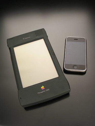
I used to have one of those Apple Newtons back in grad school. I bought one as soon as I got my first job right out of my undergrad, you know, as a pat on the back kinda thing. But boy, how time has changed…

I think Newton still has one of the best handwriting recognition softwares out there a decade after it was discontinued by Apple. After I sold mine, all kinds of Palm and Windows CE people have tried to get me to buy one of those toys. But the results were always the same — once you’ve used a Newton, everything else just sucks in comparison. Now, granted things have come a long way since, but I’ve also learned to stop relying on those PDAs… that is until iPhone came along.

Damn you, Apple. Why must you toy with my feelings.

So I have my sight set on the iPhone (though I don’t really need it per se; but I am sure Grace could benefit from having one)… as soon as I can afford to feed another mouth come this June…

Why Apple Aperture Kicks Adobe’s Butt

I’ll keep this short and try to be as objective as possible…

I’ve used Aperture for quite sometime and loved it. The problem with Aperture, though, is its inability to interpret certain RAW files produced by my camera properly. It got me to question whether RAW conversion should have been done somewhere else, which led me to looking into Adobe’s solutions — Adobe Bridge + Adobe Camera RAW.

A few problems with Bridge:
1. Unintuitive interface — a lot of assumptions were made on that you understand what each feature does; I literally had to force myself to stop using it and hop on lynda.com to take a quick tour before all the other stuff even made any sense! Adobe, this is NOT how you design great software! Take a chapter from Apple — the way features are laid out and structured should be self-explanatory!
2. It relies on other Adobe software titles to do the heavy lifting; Bridge is really just an asset management and grading system. For RAW conversion, I have to launch ACR; for basic book layout, launch Illustrator or InDesign… etc. Aperture, on the other hand, has a straight forward built-in support for some of those features in ONE place.
3. I can’t grade images while viewing them in full screen mode! What gives!?? How else am I supposed to tell if an image is sharp? Through the stupid tiny, pathetic, inflexible magnifying glass provided by Bridge? That feature is a joke compared to Apple’s solution!
4. Grading has to be done by 2-key combos — a rating of 2 has to be done via

1
command

+

1
2

where as in Aperture, my fingers are a lot happier with just hopping through the numerics. No combo keys!
5. I can’t see the rating in the main preview image or window like I can with Aperture! So if I want to know what rating I gave to an image, I have to peer elsewhere on the convoluted UI! It’s extremely inefficient.
6. If I want to play with the potentials of an image, I am forced to launch ACR, but even then I can’t just make a new version of the image and play with it until I am happy with one version like I would in Aperture (without having to make a copy of the image, that is). I literally have to stop doing one thing just so I can do something else. In Aperture, editing, grading, cropping, keywording… etc can all be done simultaneously without forcing user to “switch mode”, or so to speak.

That said, there’s ONE advantage that Bridge has over Aperture, that is its “labels” feature. Besides grading images, I can label an image with a color for any purpose. But this is such a trivial feature that I wouldn’t switch my work flow just for that.

Now, the reason I am REALLY doing this is for Adobe Camera RAW. It’s a lot more flexible and can really sink its teeth into the wide dynamic range that my RAW files give me. The color adjustments made with ACR are also a little more pleasant and more flexible to control. But besides that, there’s really no way in hell I’d continue using this system once Aperture 2 is released with matching abilities in RAW conversion. And since Aperture has this great feature that allows me to two-way an image version with Photoshop, I really see no reason why I’d use any of those other convoluted and useless products Adobe has launched!!

So my struggle continues as I try to find a good work flow for digital photography. I’m a little frustrated with Adobe in that with its 20+ years of experience in making graphics software, its softwares still can suck so badly compared to a less-than-two-year-old Apple software! Yes, you can call me an Apple fanboy. But that’s just the harsh truth about Adobe.

Now I know I won’t even bother with LightRoom, Adobe’s answer to Aperture AFTER Apple launched Aperture (how embarrassing is that for Adobe having to catch up to Apple!). All the reviews about how LightRoom forces users into using “modularized” approaches is exactly the feeling I am getting with the Bridge + ACR combo. To that, I say “Thanks. But NO, thanks.”

Crazy for the iPhone

I express mailed an iPhone for a good buddy of mine in Thailand last week. Even though the phone isn’t officially supported there, he Jailbreak’ed it in no time upon receiving the phone (incidentally, his favorite American TV series right now is “Prison Break”!). His only regret? Not getting the iPhone sooner… He owned a HTC Touch just prior to the iPhone and hated every minute of it.

So what does his Windows-owning sorry butt wants to do next? He might be getting a Mac for the next computer purchase. Hah hah!

It just gets easier to get people on board to use Macs every year. And nobody ever turns back.

Evolution of Apple.com

Neely was talking to me about the “original” Apple Computer Stores from the 80’s. But I wasn’t able to find any images of them but instead found some old snapshots of the old Apple’s website thanks to Apple Gazette and EMU. All, but the first and the last, captions are direct copy/pastes from Apple Gazette.

apple1995
The original apple.com from circa 1997.

apple1997
From 1996 to 1998 this is what Apple.com looked like. By today’s standards this site is laughable (although still better designed than MySpace), but at the time this was cutting edge.

apple1998
In 1998, Apple updated their look with this much more streamlined design.

apple2000
In 2000, Apple redesigned the site again. This new design is essentially the “missing link” between the 1998 design, and the layout that is still used today. Notice the red apple at the top of the page.

apple2001
In 2001 the front page recieved another slight make-over. This time the “News Headline” bar was given an Aqua enhancement, and the Apple at the top of the page turned blue.

apple2002
In 2002 the Apple in the top corner became gray (which it still is today). The rest of the front page remained virtually the same – only the site features significantly changed.

apple2006
The current front page design of Apple.com is almost identical to it’s 2002 counterpart, except for the “News Headline” bar, which is now a simple grey, and the addition of the iPod+iTunes tab.

apple2007
This was snapped just now in 2007. The look and feel has been significantly updated to match the look and feel of Leopard. Also various interface face elements were also cleaned up throughout the site. I suspect this new revision will be around for another couple of years or so until the next cat is out of the cage from Cupertino.